
Gymshark PDP x Product Education
Senior designer · Cross-functional team · Shipped to production · GymsharkVideo of a pop full of black leggings
The Situation
Despite strong brand recognition and a loyal customer base, we had a persistent commercial problem: customers couldn't differentiate between products.
We called it the black legging problem. Put two Gymshark products side by side and on the surface, the visual differences are minimal, but we knew that the real distinction is in the fabric, the intended use, and the technical features. And the PDP wasn't communicating any of that. Customers were landing on a product page with little to no education about what made that product worth buying, what it was built for, or how it sat within the wider range. The result was drop-off before add-to-bag and, for customers who did convert, returns at a rate that pointed to mismatched expectations at the point of purchase.
The signal came from three converging sources: NPS responses flagging confusion around product differences, CX ticket analysis surfacing repeated queries about what distinguishes one product from another, and a financial decline significant enough to escalate to the design team as a prioritised problem.
The Constraints
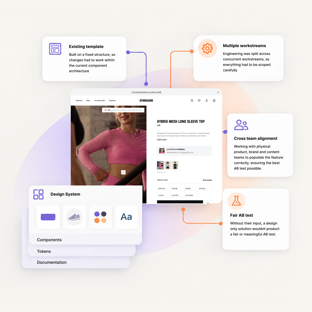
We were working within an existing PDP template that couldn't be restructured from scratch, so any changes had to integrate with the current component architecture. Engineering capacity was split across multiple concurrent workstreams, which meant any solution had to be scoped carefully to stay feasible. We also needed buy-in from physical product, brand, and content teams to populate the feature correctly. Without their input, a design solution alone wouldn't produce a fair or meaningful A/B test.
The decision that mattered
Coming out of our discovery phase, which included cross-functional research alignment across design, product, UX research, and analytics, we had identified three problem pillars: product education, upsell and cross-sell, and collection information. All three were valid. The decision was which to tackle first.
We chose education, because it most directly answered the original brief. Solving upsell before solving education would be building on an unstable foundation.
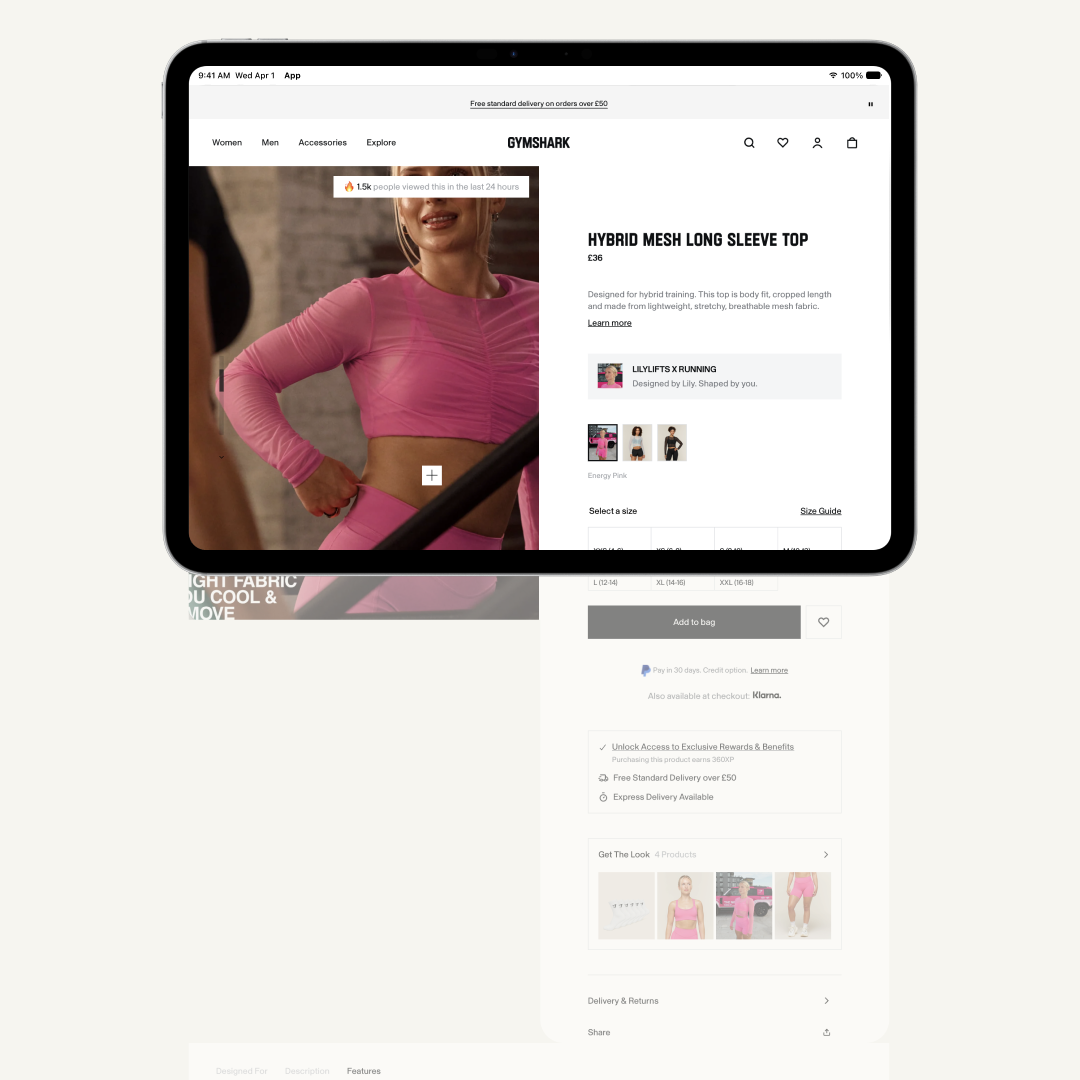
Within the education feature, the next decision was format. The natural instinct was to add content directly onto the existing page, inline, beneath the existing product information. We tested that assumption quickly. The PDP was already long, particularly on mobile, and adding further content in a linear layout would push key conversion elements further down the page and increase cognitive load at exactly the wrong moment.
The alternative was a tabbed component, a contained, sectioned format that kept the page length stable while giving customers a clear, navigable structure for different types of product information. Tabs were already an established pattern on the Gymshark site, which meant lower engineering overhead and a familiar interaction model for customers. We chose tabs. What we gave up was the simplicity of a single scrollable content block. What we kept was a page that didn't penalise customers on mobile for wanting to learn more.
My specific contribution
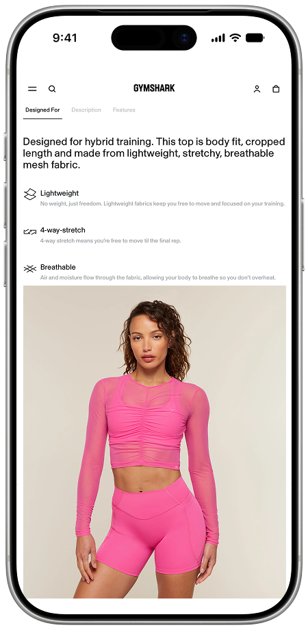
I led the design of the tabbed education component from research, build and through to handoff. Taking an early concept from another designer and building on it. Once the team aligned on the tabbed approach, I defined the three-tab structure ( Designed For, Description, and Features) and worked through the content logic for each.
The Designed For tab used a structured paragraph format, written to cover material, usage, and product features in a single digestible block (adopted from the concept). The structure had to be consistent enough to work across every product type in the catalogue, while remaining specific enough to be genuinely useful. I worked with the content team to establish the writing guidelines that made this scalable.
The Description tab was constrained by a CMS limitation: engineering could only surface a single text field, with no ability to inject additional content into it. Rather than fight the constraint, I worked around it — adding a secondary text element at the base of the tab that opened the size guide, which preserved a key customer journey without requiring architectural changes to the CMS.
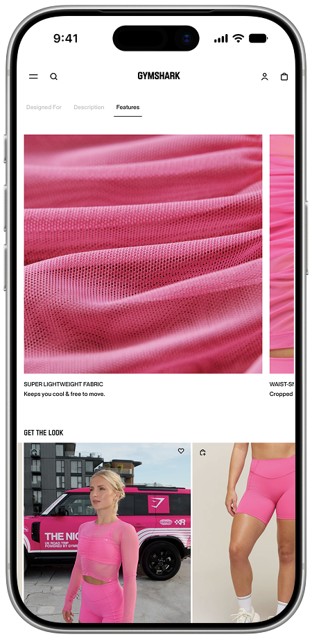
The Features tab was designed to be conditional. For base products without distinguishing technical features, the tab would be suppressed entirely. For feature-rich products, it gave the team a dedicated space to surface the details that actually differentiate a garment.
I created a presentation that documented the UX rationale behind each tab, how the component would behave across different product types, and the content requirements for each section. I then produced guidelines for the physical product, brand, and content teams — defining exactly what information was needed from each to run a fair A/B test.
The most significant challenge was not the design itself. It was aligning all parties to understand what was required of them, and why the quality of their input directly affected the validity of the test.
What I’d do differently
I'd have pushed for a measurement plan before the design phase began, not after. We made the right calls, and the test confirmed that directionally — but we can't isolate the specific impact of each tab on the metrics that mattered. Going forward, I now establish what we're measuring and how before a single frame is designed. That way, the outcome tells you something precise, not just something positive.